
FORGE
Brand Identity, Packaging Design, Visual Strategy
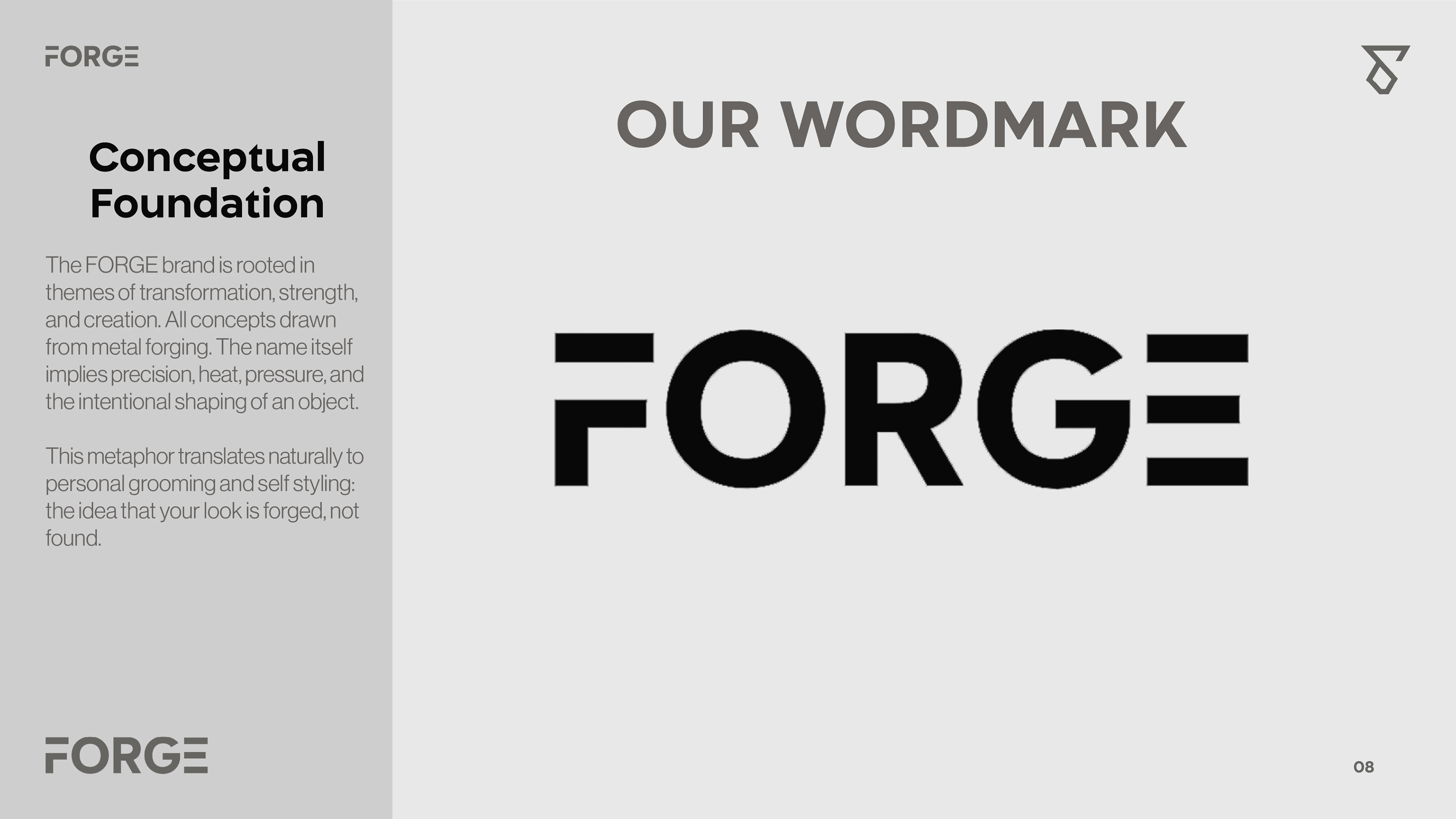
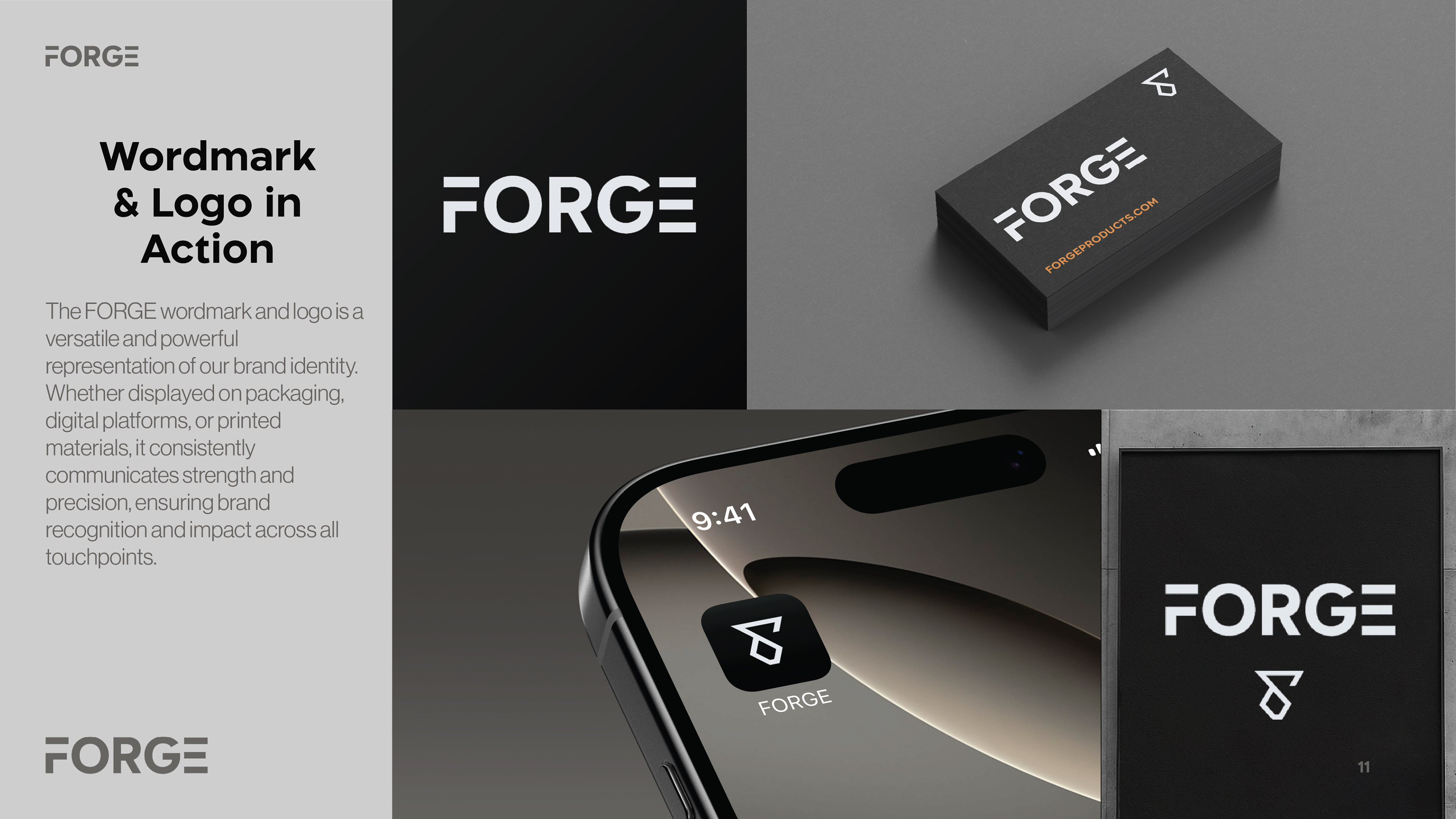
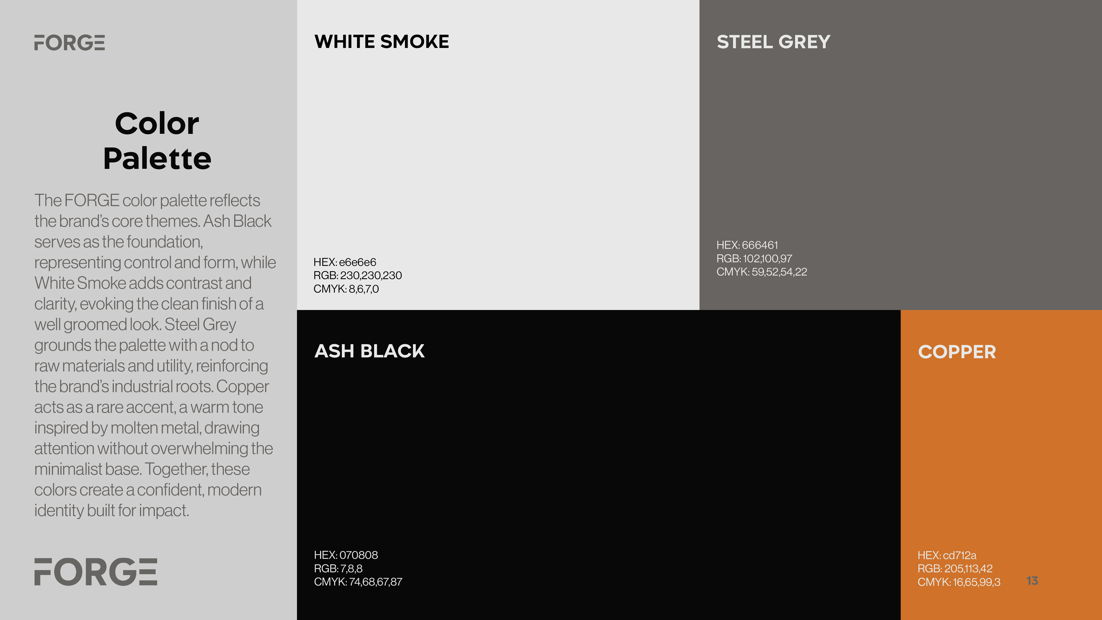
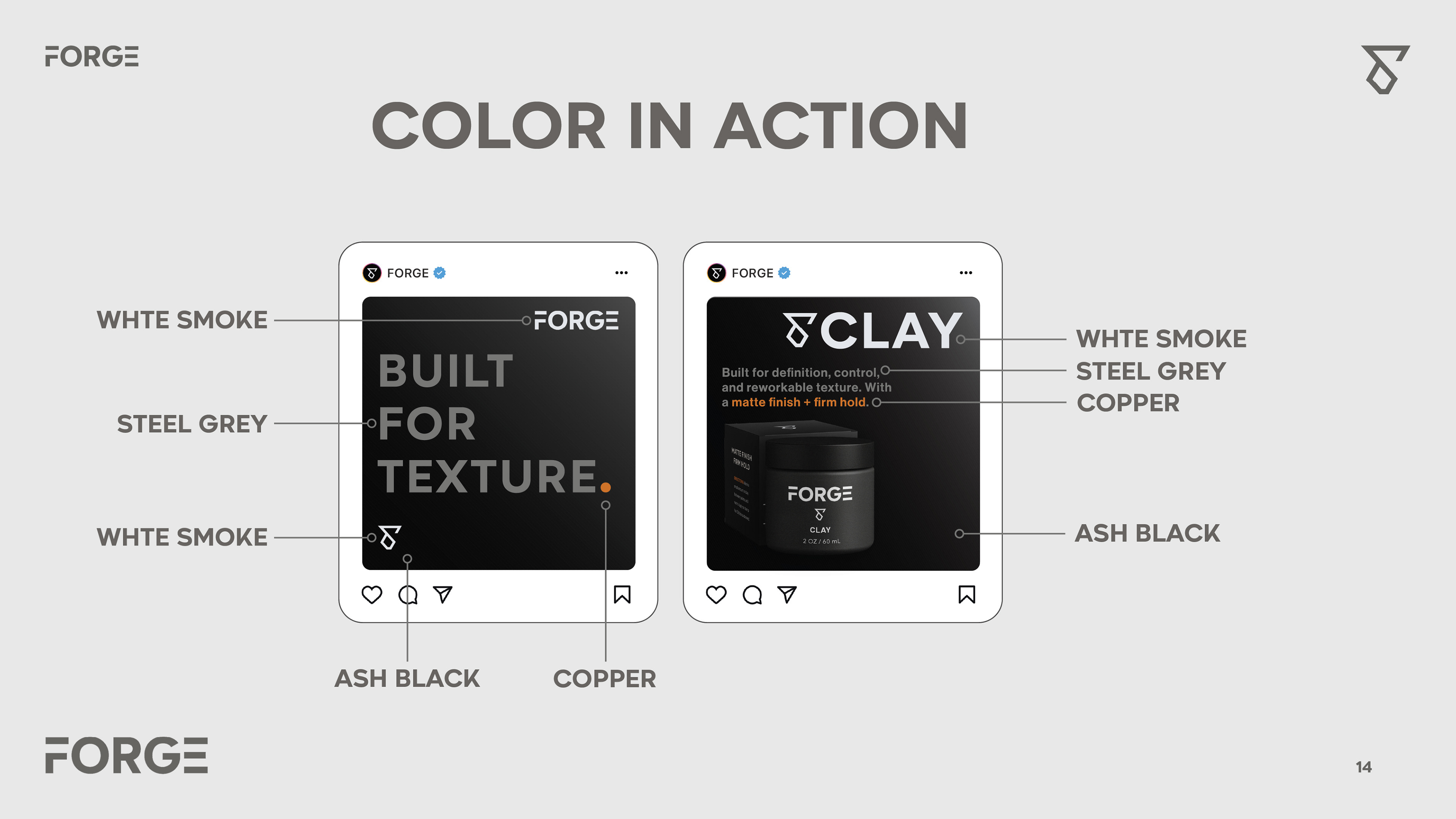
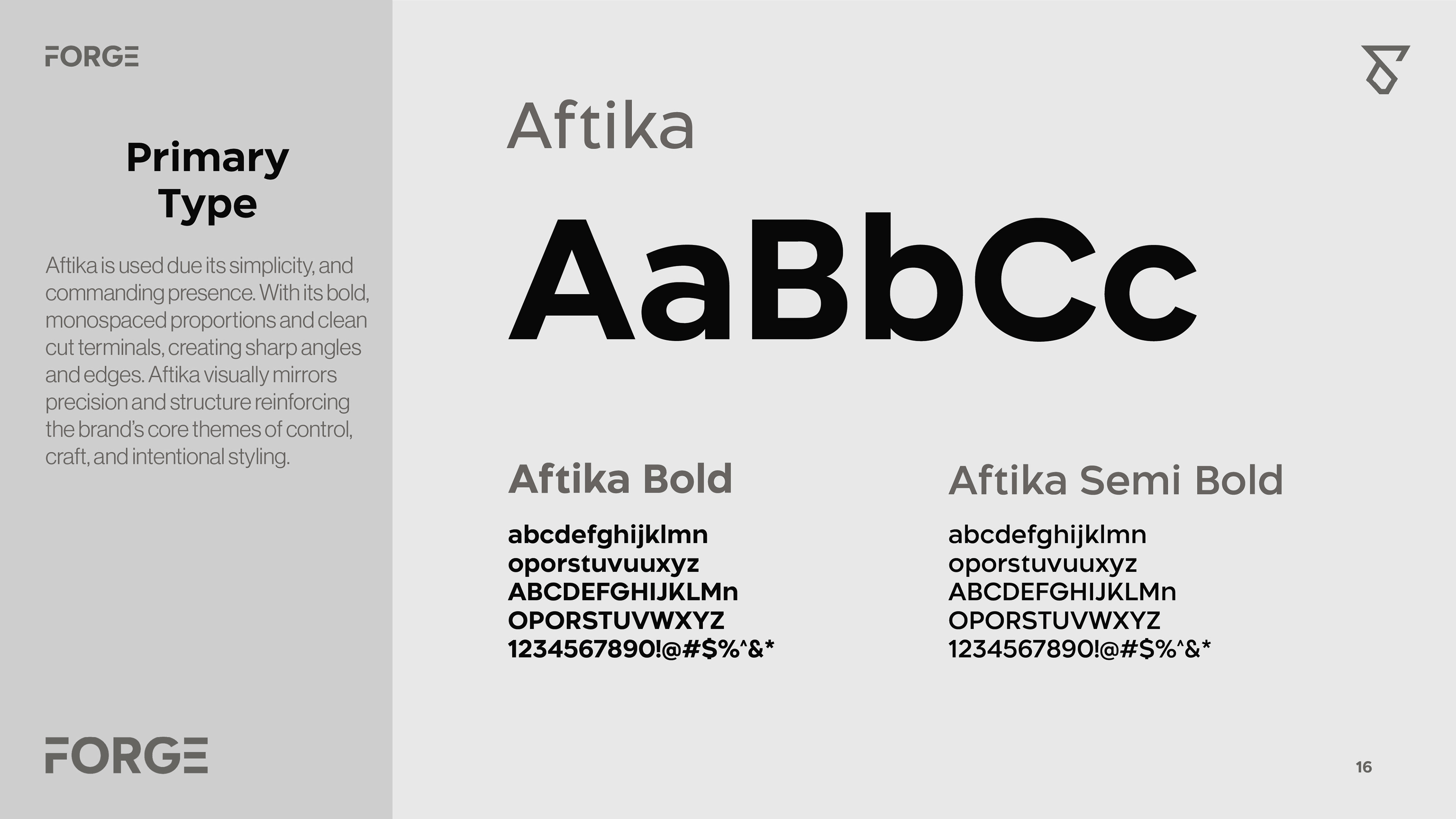
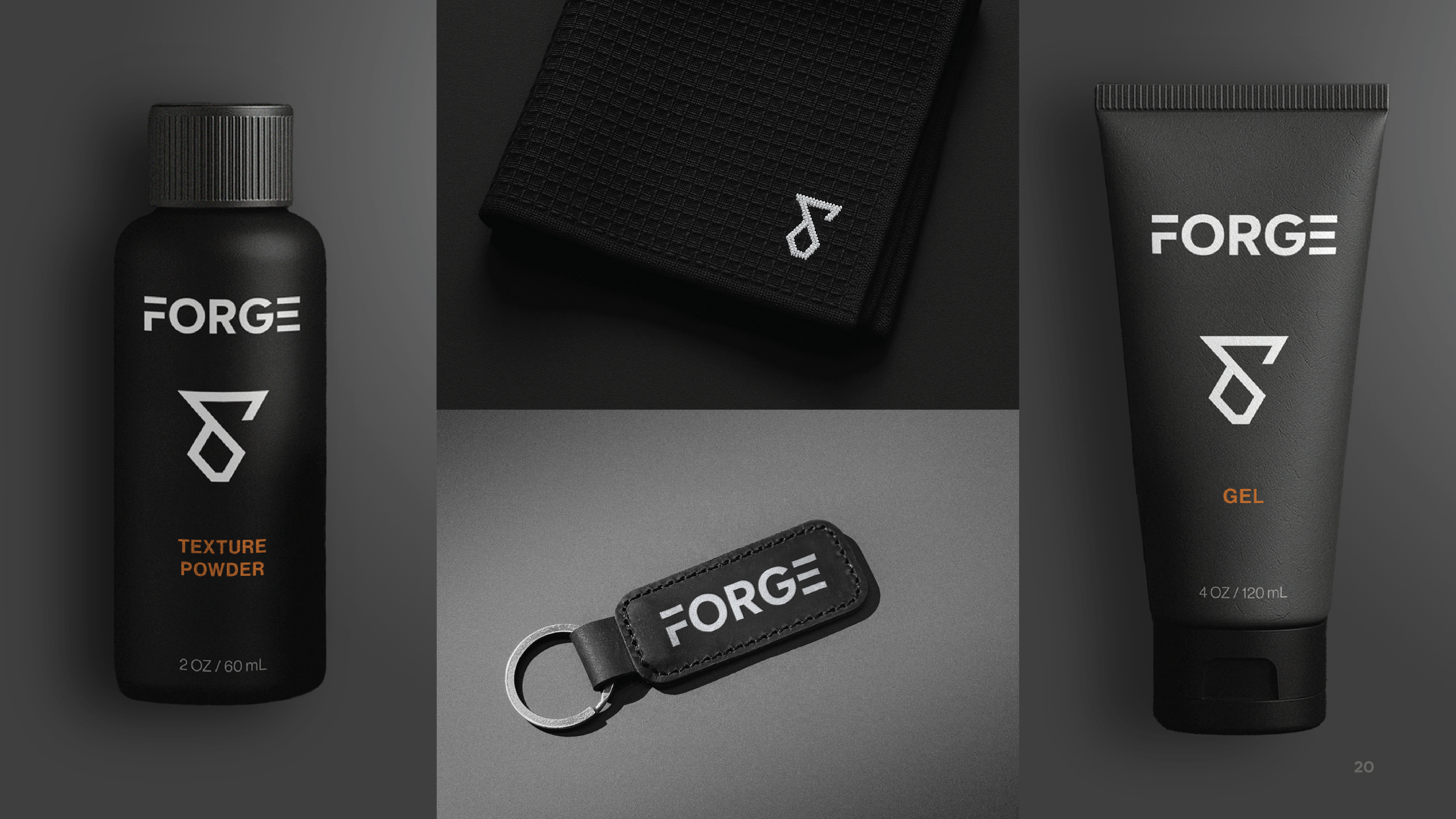
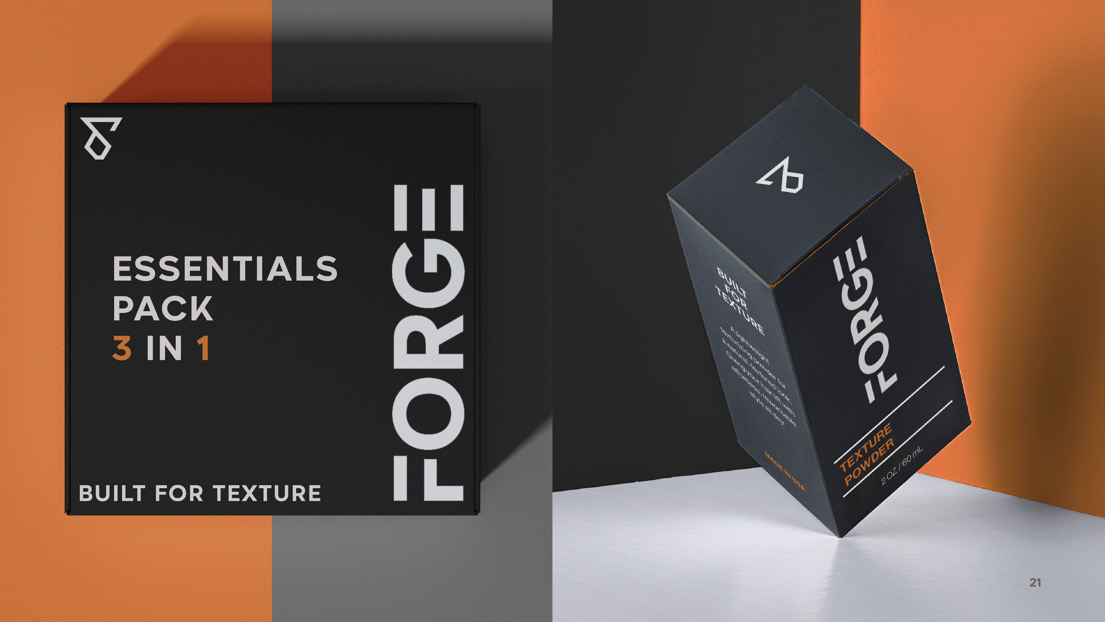
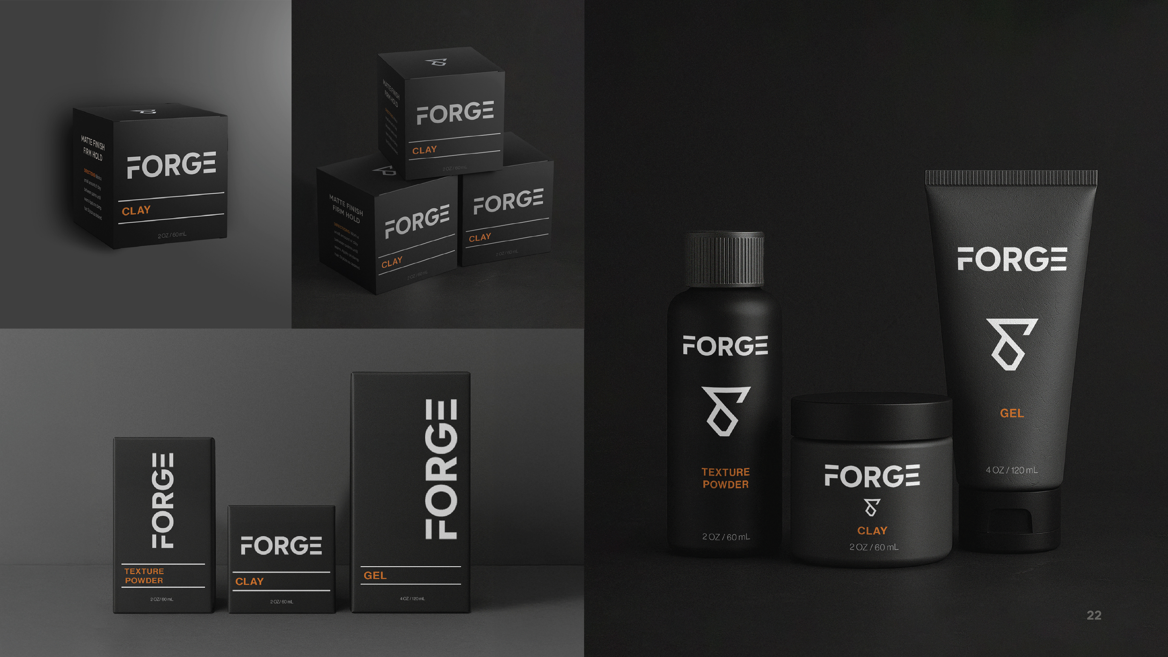
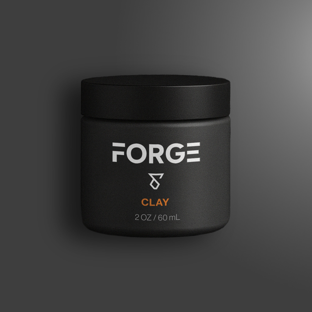
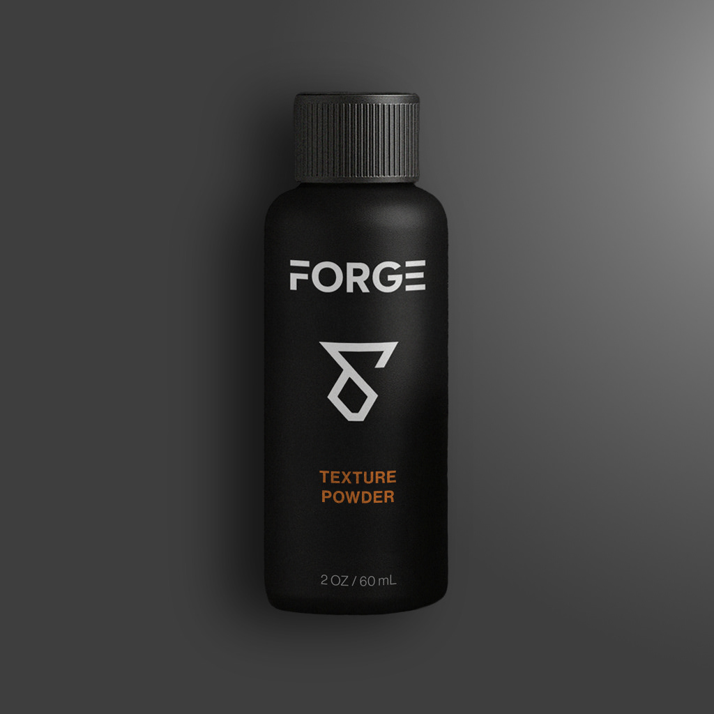
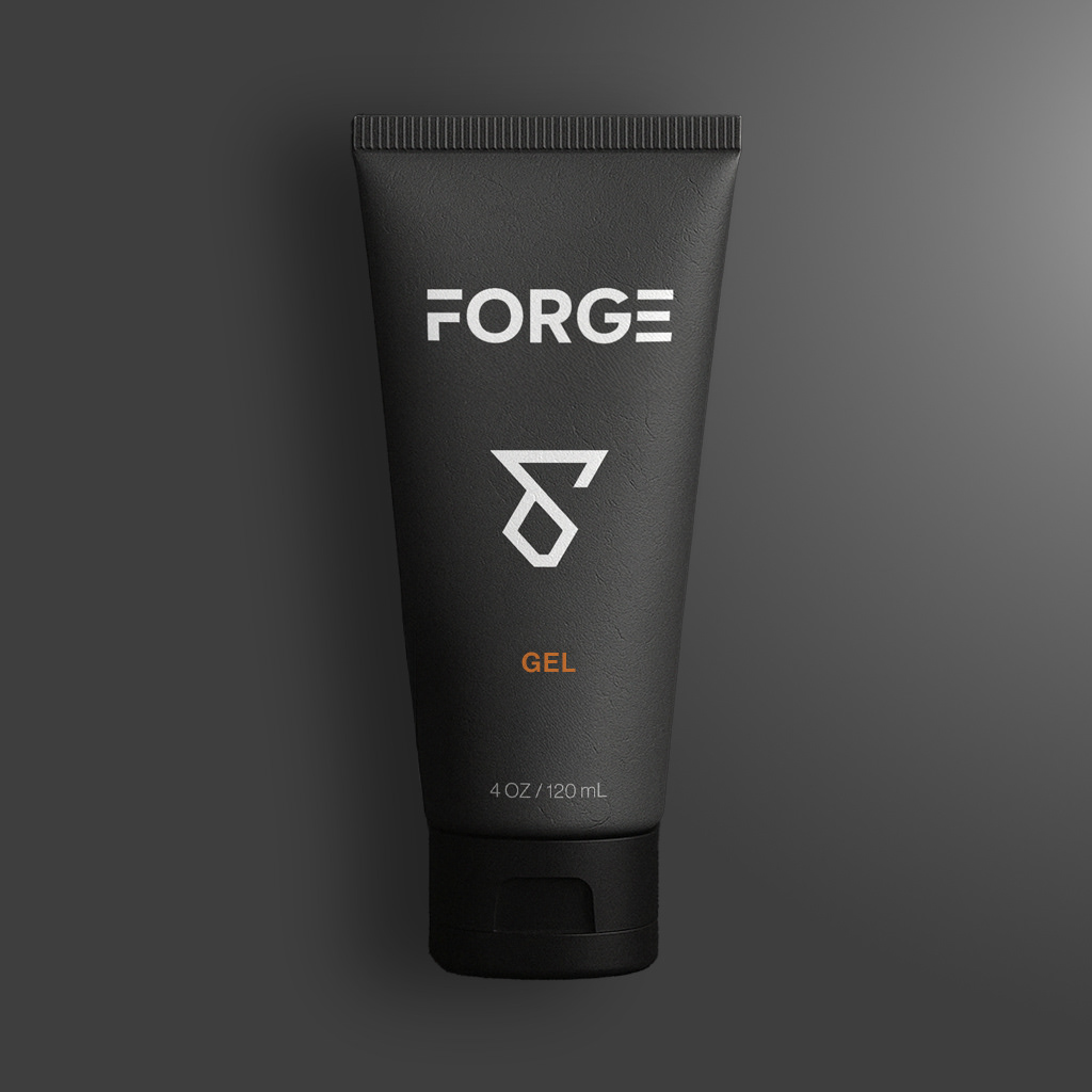
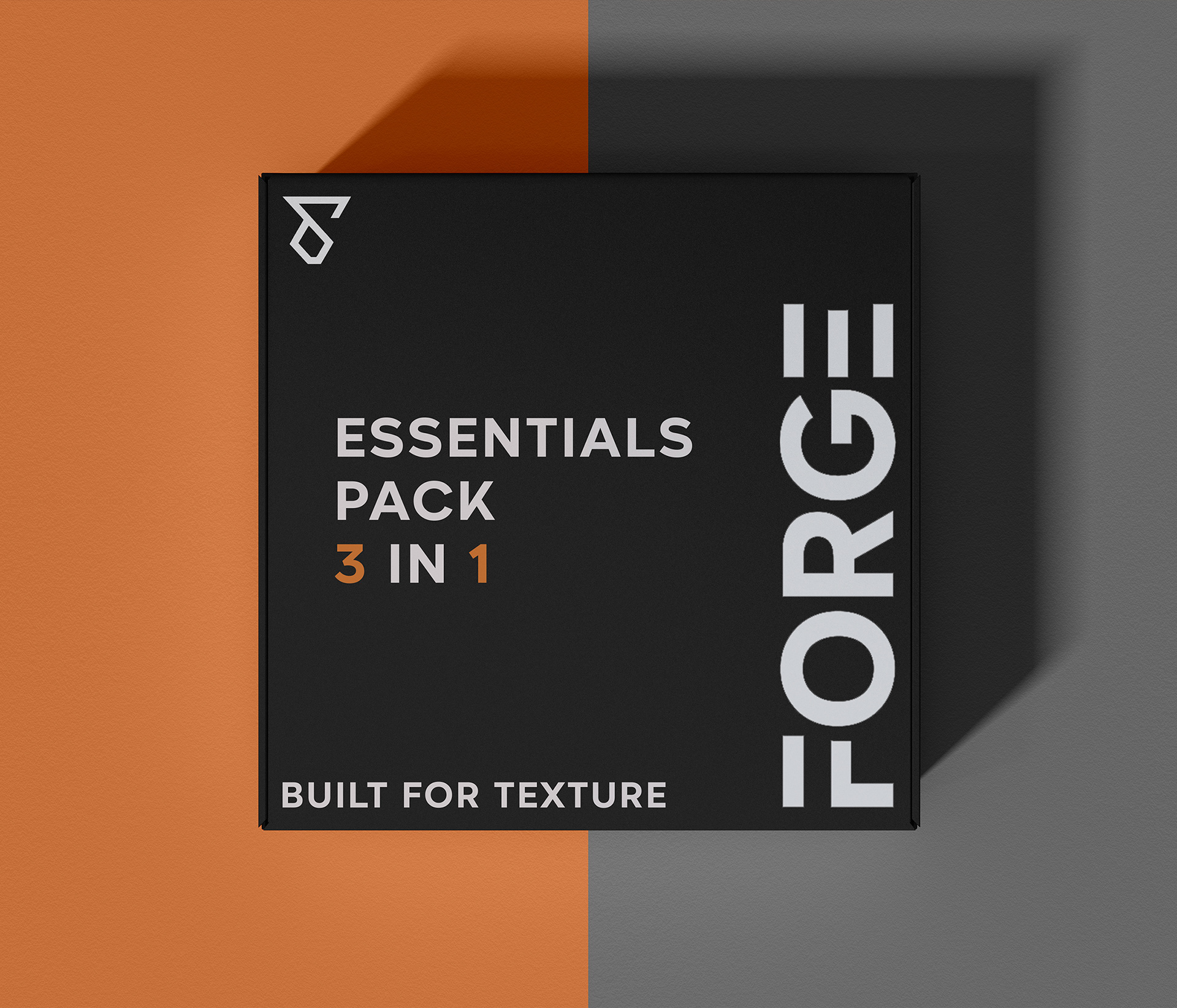
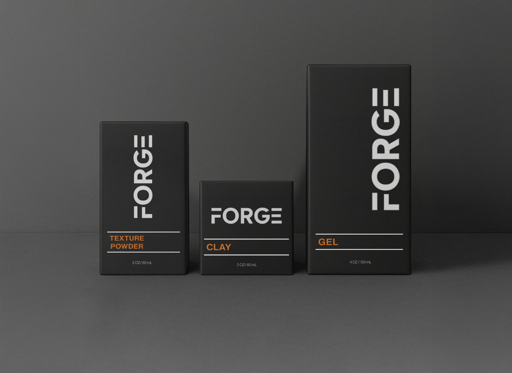
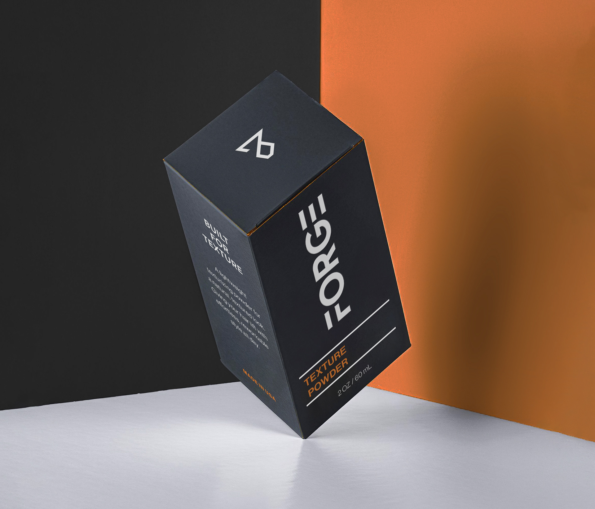
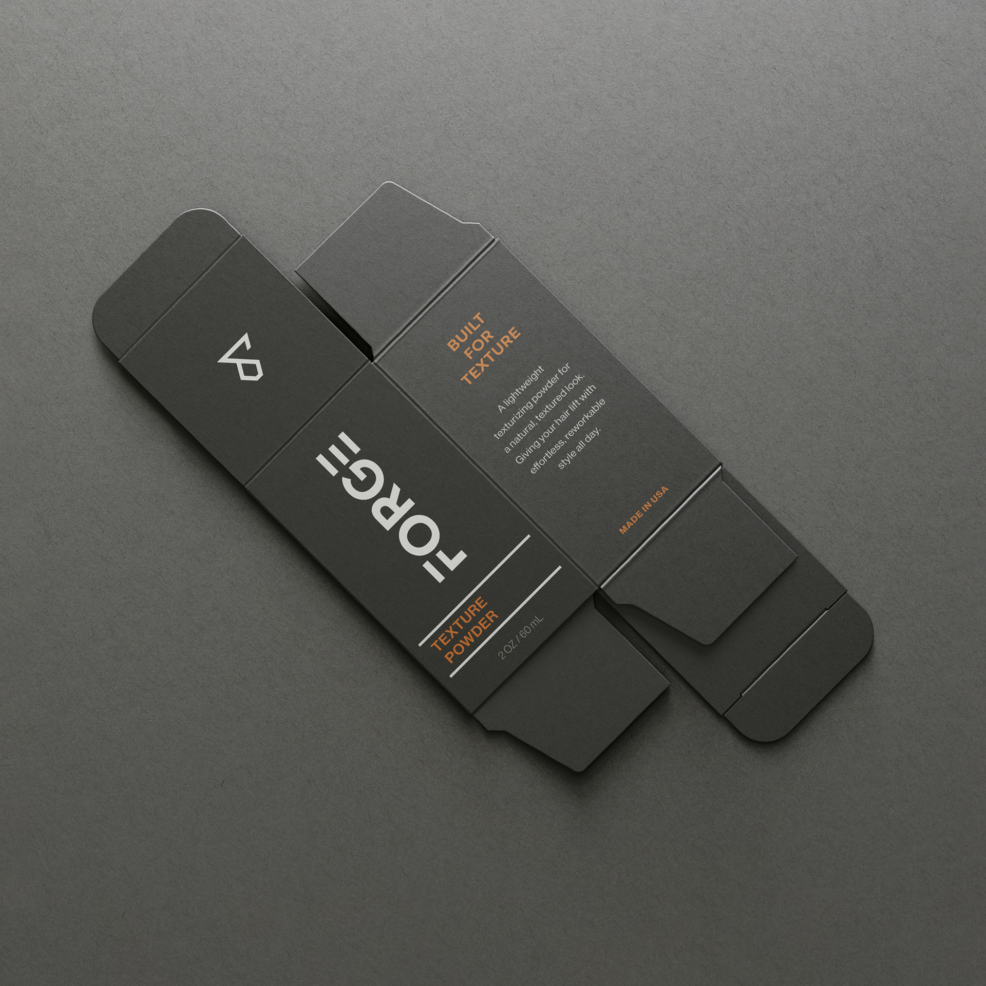
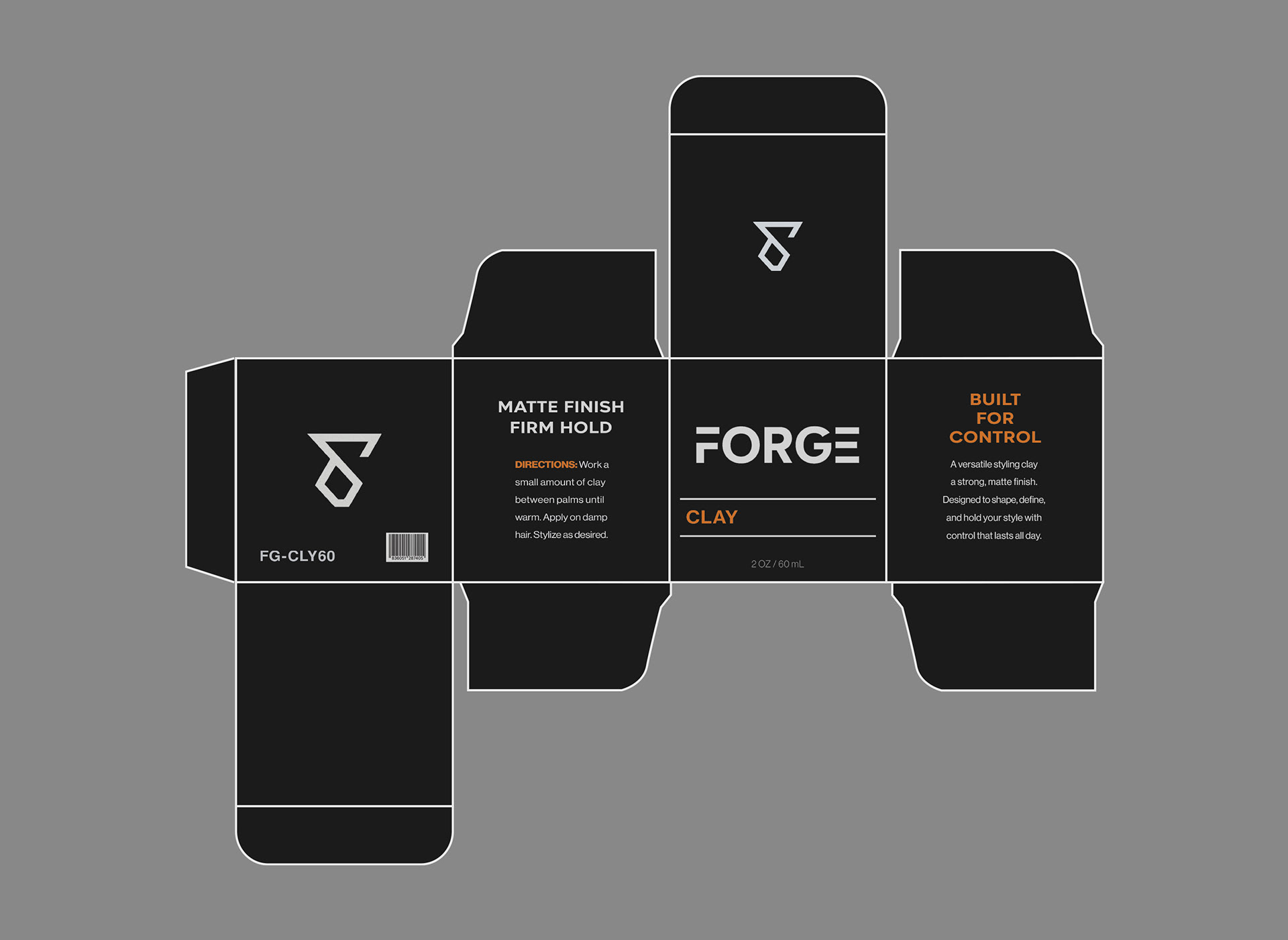
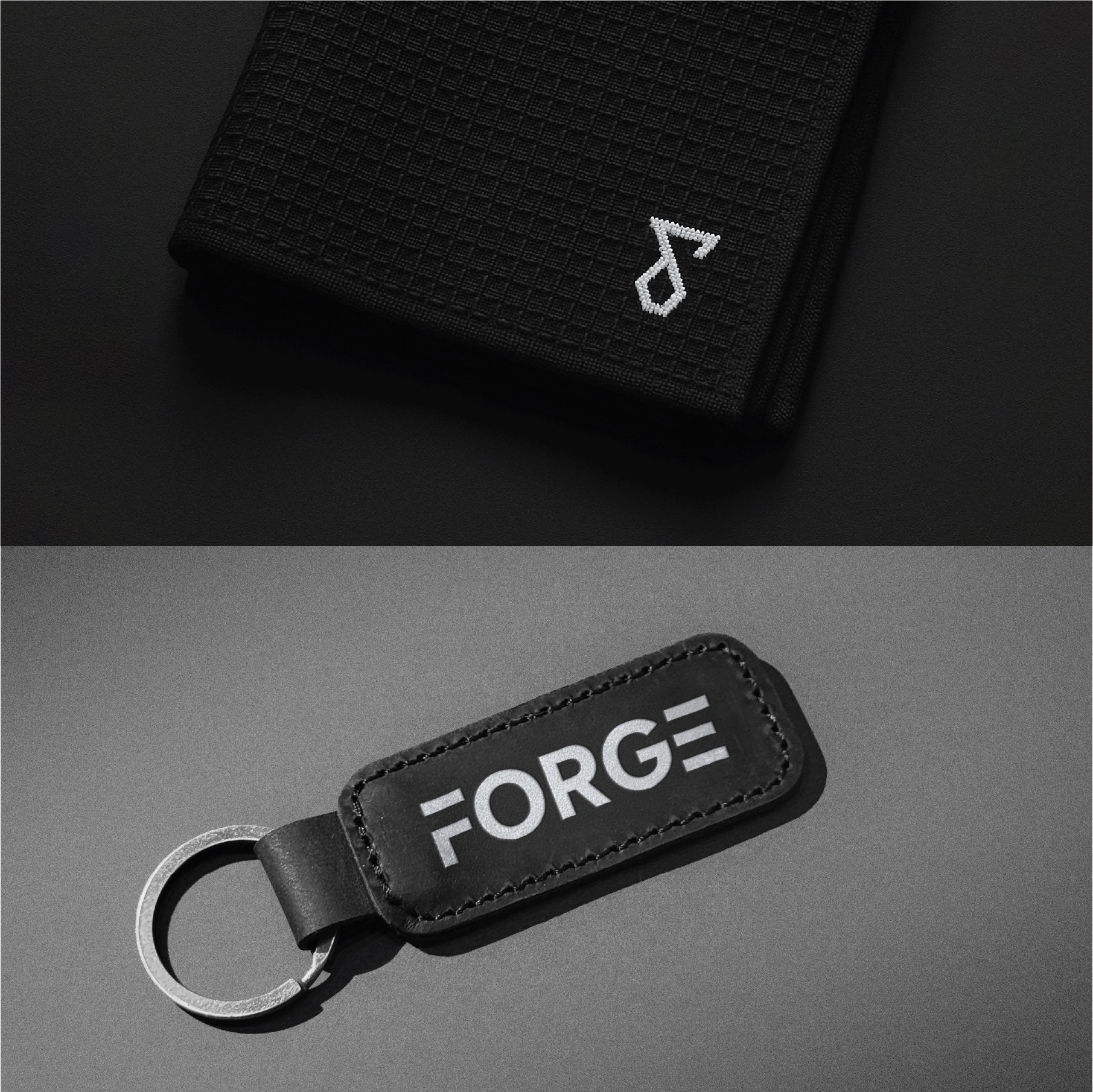
FORGE is a men’s grooming brand built around strength, control, and deliberate self-styling. I created the name, visual identity, and packaging system to reflect the idea of crafting your own look, just like metal is forged by heat and precision.
The branding blends industrial geometry with modern minimalism, bold typographic structure, a forged metal inspired symbol, and a strict grey/orange palette that feels premium but unpretentious.
The result is a bold, unified brand that stands confidently on shelves and scrolls, clean, confident, visually consistent, and built around the core idea of strength through precision.
presentation